The Psychology of Restroom Design
- Mavi New York
- Design
- The Psychology of Restroom Design
A well-designed restroom is a blissful experience for users. It radiates a sense of relaxation, cleanliness, and privacy, and provides quick relief. It is a commonly used space that we use daily, and it is more than a necessity. As a “Division 10 specialty” company in New York City, we collaborate closely with architects, project managers, and construction companies who design great commercial restrooms for schools, healthcare facilities, retail spaces, public parks, and corporate office buildings. Their projects refer to specialty items like toilet partitions, lockers, and restroom accessories. When you are dealing with these items, the design specification of a restroom is often more than just a “feel-good” factor. For example, the color choice of the partition can have a direct impact on the safety and accessibility of the restroom. In this article, we will explore a deeper analysis of the psychology of restroom design based on our experience.
Why is the psychology of restroom design crucial?
A restroom is far more than a collection of fixtures; it is a space for rest, like a brief sanctuary. We will find out how restroom design communicates an establishment’s values by creating a sense of privacy and safety. A well-designed restroom has the power to shape a user’s emotional state, influence their perception of cleanliness and safety, and communicate the core values of an establishment without a single word. In a city like New York, where public spaces are heavily used, a person’s sense of psychological comfort is linked to their feelings of safety and hygiene. The design of a restroom must actively address these fundamental needs, transforming a potentially vulnerable experience into one that is restorative and reassuring. In this article, we will study the psychology of Restroom design in New York City. The foundational pillars of effective restroom design are those that build trust in the strategic application of color and the right materials.
The Foundational Pillars: Privacy, Safety, and Trust
At the heart of any successful restroom design is the creation of an environment where the user feels secure and at ease. The psychological need for privacy and safety is a non-negotiable cornerstone in any commercial restroom construction work. A person’s comfort in such an environment is a direct reflection of their perception of its cleanliness and safety.
Subtle Cues for a Secure Experience
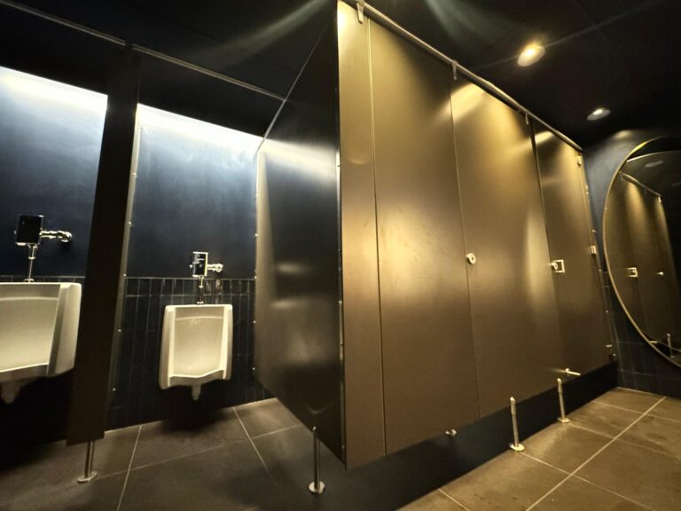
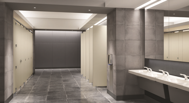
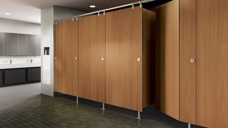
True privacy in a public restroom goes beyond the simple presence of a closed stall door. One of the most effective strategies is the use of strategic partition design to remove visible sightlines. This involves addressing common weak spots, such as the gaps that often exist above or below the stalls, or clear views that can be provided between the door and the frame. For example, our solid plastic toilet partitions made from High-Density Polyethylene (HDPE) plastic can be specifically engineered with shiplap cut edges and continuous edge-mounted hinges that perfect the seam once the door is closed, providing a true sense of zero visibility. Trivial details like angled doors and hidden hardware can also contribute to this heightened sense of privacy, creating a space where occupants can feel worry-free.
The NYC Challenge: Designing for Trust
A well-designed restroom in a city like New York City becomes a form of public service and trust-building. A considerable number of public restrooms are closed or plagued by issues such as broken locks and unsanitary conditions. The urban restroom design has unique design challenges that directly impact a user’s psychology. The ideal design balances personal privacy with a subtle sense of connection to the outside, assuring the user that they are not isolated or trapped.
The Art and Science of Color: Shaping Mood, Guiding Action
Color is a powerful tool in restroom design, like any other space. It can influence emotions, shape mood, and even affect a person’s behavior without them ever realizing it. A truly expert Division 10 architect understands the color’s psychological impact. The skillful manipulation of design elements like context, tone, and saturation allows a designer to create a specific atmosphere and achieve a strategic goal.
The Strategic Application of Hue
The application of color in public restrooms must be a deliberate act of communication. The following examples demonstrate how three distinct colors can be leveraged to create a specific mood and reinforce an establishment’s identity.
The Cheerful Spark: Yellow in a Restaurant
Yellow is a color synonymous with happiness, cheerfulness, and brightness. In a casual, family-friendly restaurant, a vibrant yellow can create an uplifting and welcoming atmosphere. However, its purpose extends beyond simple aesthetics. Yellow has a unique ability to stimulate the mind and promote a sense of alertness and encouragement. In a high-traffic diner, this can be a strategic tool, as yellow “animates us to move quickly” and encourages a quicker turnover of guests, an important consideration for a business that relies on volume. The challenge is to choose the right tone, as a yellow that is too bright can cause agitation, while one that is too dull may evoke feelings of jealousy or illness. The designer’s skill lies in finding the perfect balance to create a “burst of cheerfulness” without overstimulation.

The Luxury of Calm: Sapphire Blue in a Hotel.
In a high-end, five-star hotel, the design of the restroom must communicate opulence and a sense of escape. Sapphire blue is an ideal choice for this environment, as it is a rich, vibrant hue that evokes “eminence” and “sophistication”. This color’s psychological power is well-documented; it is associated with calmness, serenity, and mental clarity. The use of sapphire blue in a hotel restroom is a deliberate strategy to promote a peaceful and tranquil atmosphere, providing a sense of escape from the fast pace of urban life. This calming effect reinforces the hotel’s brand promise of a luxurious, restorative experience, where guests can relax and linger without feeling rushed.
Color | Associated Psychological Moods | Best-Suited Environments | Key Considerations |
Yellow | Joy, Optimism, Alertness, Encouragement | Casual Diner, Kitchen, Hallway | Use sparingly to avoid agitation. Tone and saturation are critical. |
Sapphire Blue | Serenity, Calmness, Mental Clarity, Sophistication | High-End Hotel, Spa, Office | Balances well with neutrals (gray, white) and complementary colors (orange). |
Biophilic Design: Bringing Nature In
Biophilic design in a bathroom integrates nature to create a soothing, spa-like atmosphere that promotes well-being and relaxation. In a densely urbanized environment like New York City, where contact with nature is often limited, biophilic design is not a mere trend; it is a vital strategy for mental and physical restoration. The core principle of biophilia is the innate human need to connect with nature, and integrating natural elements into an indoor space is a powerful way to create a “feel-good” environment. This approach has been shown to reduce stress, improve mood, and even enhance cognitive function. Our solid plastic (HDPE) toilet partitions with their biophilic design offer aesthetic appeal to your commercial restaurant.
Positive First Impressions and Aesthetic Appeal
Making a strong positive initial impact can make users more forgiving of other minor issues or areas that might not be perfectly designed. The design of a public restroom is a powerful, non-verbal audit of an establishment’s values. The design of a public restroom is a powerful, non-verbal audit of an establishment’s values. In the psychological study of design, the “Halo Effect” is a cognitive bias. A positive impression of one element, such as a luxurious restroom, influences a person’s feelings about the entire brand. A pristine, well-appointed restroom signals a meticulous mindfulness and reinforces a brand’s promise, which in turn can justify premium pricing and generate positive reviews.
A comparative study of two restrooms: the hotel vs. the restaurant
Let us compare the design choice of a high-end, five-star hotel in Manhattan and a casual, family-friendly restaurant in Times Square. Although both are aiming for cleanliness and functionality, they must communicate fundamentally different brand values.
High-End, Five-Star Hotel: The restroom in a luxury hotel is an extension of the brand’s identity of elegance and exclusivity. The design is an intentional part of the guest’s journey, created to provide a luxurious experience. A good architect achieves this through premium materials such as marble vanities, designer tiles, and solid wood partitions. Technology plays a significant role, with features like touchless faucets, heated seats, and integrated sound systems that create a sophisticated, hygienic, and spa-like atmosphere.
Casual, Family-Friendly Restaurant: The restroom in a casual diner must communicate a sense of approachability, friendliness, and high-volume efficiency. The design is less about luxury and more about durability and flow. The choice of toilet partition materials reflects this, with durable and easy-to-clean options. Vibrant colors like yellow create a lively and engaging atmosphere. A smooth, well-planned layout with clear pathways and adequate capacity is essential to oversee the high traffic volume efficiently.
A user’s experience in a public restroom serves as a subconscious audit of an establishment’s true values. The “Halo Effect” demonstrates that a design that is consistent with the brand’s promise reinforces customer loyalty and satisfaction.
Design Aspect | High-End Hotel | Casual Diner | Psychological Intent |
Materials | Marble, solid wood, high-end metals, and glass partitions | Plastic laminate, powder-coated steel, stainless steel | Conveys luxury and opulence; Conveys durability and affordability. |
Lighting | Soft, warm, and thoughtful ambience or backlighting | Bright, cooler lighting to enhance visibility and cleanliness | Creates a cozy, relaxing atmosphere; Creates an energetic, efficient mood. |
Technology | Touchless faucets, heated seats, and integrated sound systems | Hands-free locking mechanisms, high-tech hand dryers | Reinforces a sense of modernity, hygiene, and luxury; Improves efficiency and reduces germ spread. |
Color Palette | Professional neutrals (white, gray) with rich accents (sapphire blue) | Bright, vibrant, and energetic colors (yellow, orange) | Exudes sophistication and refined taste; Creates a lively and welcoming atmosphere. |
Division 10 and Accessibility
For an architect working on a division ten project, the question of color extends far beyond aesthetics. Division 10 specialties, such as grab bars and toilet partitions installations, have a direct and profound impact on user safety and accessibility. The most critical question to ask about color when selecting these items is: “Does this color provide sufficient contrast and visibility to ensure safety and accessibility for all users, especially those with low vision?”
Color, Contrast, and Safety
The color of a grab bar, for example, is not a minor detail; it is a crucial safety feature. Enhanced visibility is essential for people with low vision, as it helps them quickly locate and use the bar for support, which can prevent slips, falls, and injuries. A high-contrast color also improves depth perception and serves as a visual cue, providing a sense of independence and reducing the anxiety and stress that can accompany navigating a new space.
This intentional use of color for safety is a form of non-verbal communication. For example, Universal safety guidelines use standardized colors—red for danger, orange for warning, and yellow for caution—to convey critical information in an instant. A designer, in choosing a brightly colored, high-contrast grab bar, is leveraging this universal language to communicate security and provide guidance without the need for signage. Furthermore, ADA requirements mandate a minimum of 70% contrast between a sign’s characters and its background. They are not just legal hurdles; they are a framework for designing human dignity and psychological comfort. A compliant, high-contrast sign with a non-glare finish ensures that everyone, including those with visual impairments, can navigate the space with confidence and ease.
Division 10 Element | Required Feature (Examples) | ADA Standard | Psychological Benefit |
High-contrast color (e.g., white, bright red); non-glare finish | Required, as part of ADA compliance | Reduced anxiety, improved confidence, enhanced safety, and independence for users with low vision. | |
Signage | Tactile text and Braille; At least 70% color contrast | Required, as per ADA standards for permanent rooms | Fosters inclusivity, promotes independence, and ensures that critical information is accessible to everyone. |
Shiplap cut edges, continuous hinges, floor-to-ceiling design | N/A (aesthetic and privacy choice) | Provides a true sense of privacy and security by eliminating sightlines. |
The design of a restroom, especially in a city as dynamic as New York, is a profound opportunity to shape human experience. It is a synthesis of aesthetics, psychological principles, and a deep understanding of human needs. A truly expert design elevates the space from a purely functional necessity to a brief, restorative sanctuary.
The analysis presented in this report reveals that the most effective restroom designs go beyond superficial beauty. They build a foundation of trust through subtle cues that enhance privacy and safety, a critical consideration in an urban context where public distrust is a genuine challenge. They leverage the powerful, subconscious language of color to reinforce a brand’s identity and guide user behavior. Finally, they incorporate the principles of biophilic design and accessibility, not as optional trends or legal burdens, but as essential strategies for mental and physical well-being.
By viewing every project as an opportunity to create deeply empathetic spaces, a designer can craft a restroom that is not just beautiful but is a quiet testament to an establishment’s genuine commitment to the comfort and dignity of every person who enters.
At Mavi New York, we specialize in high-quality custom-made restroom partition solutions tailored for durability, hygiene, and visual appeal. Whether you are designing a restroom for a restaurant, healthcare facility, retail space, or corporate office, our expert team will help you elevate user satisfaction and brand perception.
Contact us today at 718-874-3805 to explore our full range of commercial restroom solutions or request a free quote.